


ell'bleu
Brand Identity
Conveyor-belt sushi & salad buffet restaurant brand of LFfood.
Beautiful sea for her - ell’bleu
‘ell’bleu’ symbolizes beautiful sea, and deliver a smooth and deep sensibility by watercolor technique.
Also, the fish in symbol mark inspired by the painting of Matisse represents fresh vividness and unique image at the same time.
Participation rate 45%


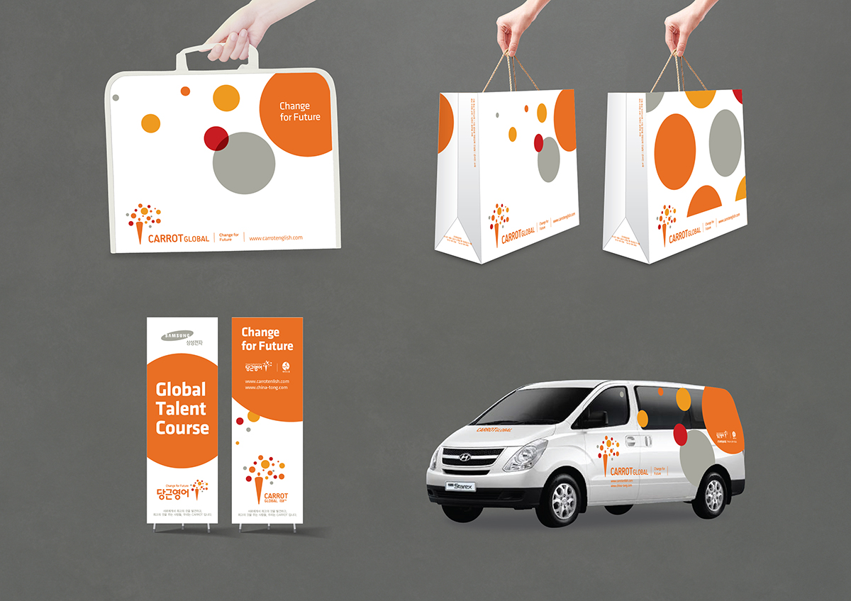

Carrot Global Corporate Identity
English educational institution Carrot Global's Corporate Identity.
The symbol mark presents the vision of self-actualization through the growth of people.
The form of carrot represents the growth of the person, and circle's various dynamic movement symbolize the dream's realization.
Participation rate 35%


california bakery & cafe Brand Identity
california bakery & cafe brand located in Dunsan-dong, Daejeon, Korea.
The bird and leaves of ’cali bird’ represents sensibility of the fairy tale, beauty, and exoticism for women who is main target.
'cali bird' above the word ’c’ expresses the confidence of product, and trust of the brand.
The warm color of 'cali orange' raises taste, and low saturation color represents a luxury.
Participation rate 65%


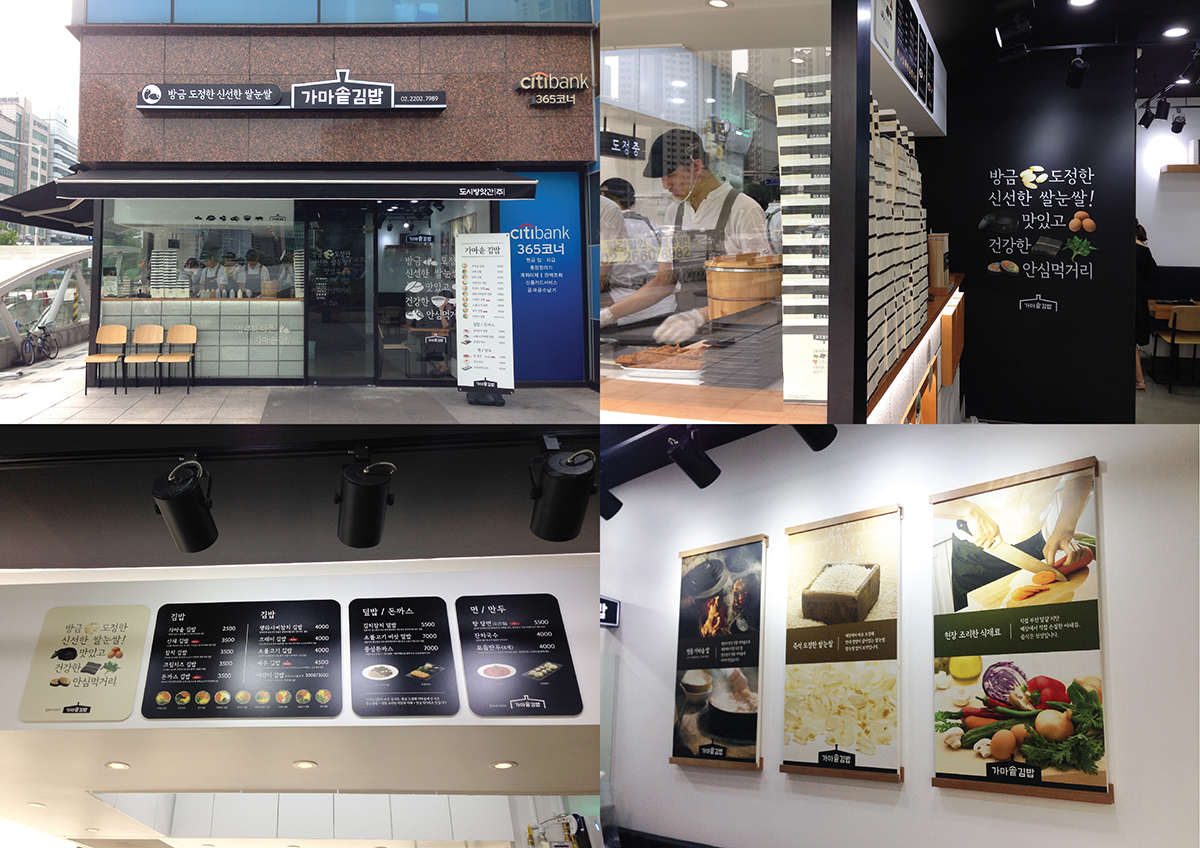
가마솥김밥 Brand Identity
Premium Gimbab restaurant brand identity of Ottospace.
The word mark of 'Gamasot Gimbab', which is modernistic designed Korean traditional cauldron, represents the honesty and confidence of the brand by use the cauldron itself.
Also, the design elements that explain the brand directly emphasize on the honesty and credibility of the brand.
Participation rate 50%

쏘세지와 닭이 맛있는 집 Brand Identity
SUNREX Corporate Identity
All rights reserved © GAEUN SHIN 2022